7 Gorgeous PT Clinic Logos We Love
Your clinic’s logo is more than just a pretty picture—it’s the symbol that reflects your clinic’s culture and brand. Here are a few logos we love.

Subscribe
Get the latest news and tips directly in your inbox by subscribing to our monthly newsletter
It’s a psychological fact: the human brain loves symbols. They can evoke emotion, inspire movements, and communicate big ideas with one simple image. For that reason, when physical therapy practice leaders choose their logos, they’ve got to think critically about the message they want to send. After all, that’s the image every patient, referral source, and business partner will come to associate with their practice.
With that in mind, here are seven clinic logos that we think got it right:
1. Axes Physical Therapy

Our first pick comes from Axes Physical Therapy, a multi-location practice based in the St. Louis area. This logo is particularly well balanced and, as WebPT Senior Graphic Designer Jesus Garcia notes, has “a great sense of contrast and hierarchy for each of the parts.” In other words, the bold colors and similar height of the logo and clinic name complement each other, and the smaller gray “physical therapy” ensures the important parts of the brand are the emphasis. The lowercase typeface gives a friendly, approachable impression to anyone who sees it, which is a vibe any PT clinic should want to give potential patients. Garcia also points out that “the symbol itself is well designed, goes with the name, and is set in a good angle to convey motion.” Conversely, if it were straightened and symmetrical, it would look flat.
2. Viverant

Next, we have this logo from Viverant, and it ticks a lot of boxes that make a logo fantastic. Garcia notes that “the abstract ‘V’ mark is vibrant and kinetic, and it can be used alone for favicons, avatars, and thumbnails.” The bright, cheery green is vibrant, energetic, and unique while still appearing professional. Overall, the entire logo is clean, simple, and corporate-looking, which, as Garcia explains, “could give a new patient a sense of confidence and reassurance that the clinic knows exactly what they're doing.”
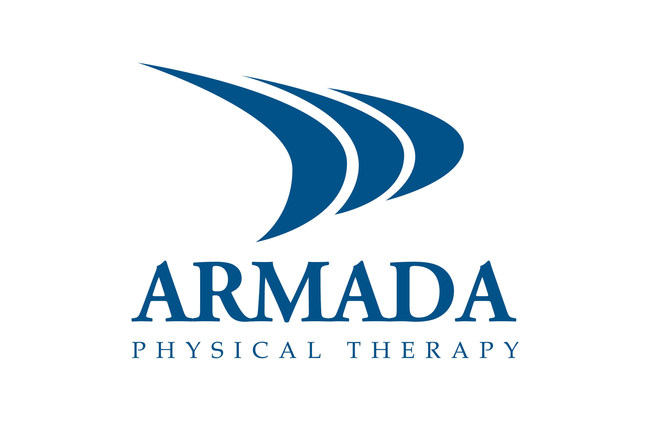
3. Armada Physical Therapy

Next, we have this unique and minimalist logo from Armada Physical Therapy in New Mexico. This one stands out because—unlike many other PT practice logos—it’s not portraying a person. Instead, the logo is a set of abstract ship sails, which aligns with the clinic name while still communicating movement and team unity. “The logo doesn't have to be overly detailed, because it’s arranged, illustrated, and sized perfectly to convey a nice abstraction of sails,” Garcia notes.
4. Pivot Physical Therapy

We’re also fans of this logo from Pivot Physial Therapy, which conveys movement and healing without simply using an illustration of a person. As Garcia explains, “They're clever in using the V in their name to show motion—as if the ‘right arm’ of the V is successfully moving down over the O thanks to treatment.” In a nutshell, it’s simple, professional, and clever.
5. Physical Rehabilitation Network

Garcia gives Physical Rehabilitation Network props for creating a logo that is “simple, clean, and easy to read—no matter how big or small.” He notes that a clean design like this one makes an excellent logo, because you can scale it down to any size and it’ll still be immediately recognizable.
6. IRG Physical Therapy

We love IRG Physical Therapy’s logo for its simplicity and its smart portrayal of the clinic’s hand therapy focus. “They have something going with the abstract mark created with the ‘hands,’” Garcia notes. “It's reminiscent of Chase's blue octagonal mark.” We also like the potential for additional simplification in future versions. (Think about the evolution of the Apple logo, for example.)
7. Hulst Jepsen Physical Therapy

Finally, we love this creative spin on a classic abstraction from Hulst Jepsen Physical Therapy in Michigan. “Although it’s common to see some kind of an abstract symbol of a person for physical therapy logos, I like how this one uses another common symbol that we're familiar with—the arrow—for the arms and legs of the person,” Garcia says. He also notes the person’s wide range of motion, which implies the individual benefited from physical therapy treatment. Garcia also called out the subtle taper effects on the arrows. “This helps, again, with the notion of movement, especially the bottom ‘leg’ arrows. It makes the person look like they’re ‘jumping for joy.’” A few other things this logo gets right are:
- nice, even spacing between all the parts;
- neutral, clinical colors—without being dull;
- strong, professional typeface; and
- well-sized hierarchy, which emphasizes the clinic name above all.
Ultimately, your logo is just one small part of your brand identity. Having a pretty logo is awesome, but ultimately, it’s the patient experience that matters most. If you have that nailed down, your logo will eventually come to represent the quality care you provide—no matter what it looks like.


